Web Design for UX: 11 Elements That Drive Conversions

I love visiting awwwards.com for design inspiration. The sites are bold and often push creative boundaries, which makes them fun to explore.
However, the excitement often fades as soon as I start clicking through some of the showcased sites. I land on that one site that looks amazing, but the pages drag as they load, animations feel heavy, and the browser lags.
What initially looked inspiring begins to feel like a bit of a time killer. And instead of exploring the site any further, I close the tab.
Reactions like these happen almost instantly.
Studies show it takes just 0.05 seconds for someone to form an opinion about a website, and 94% of that opinion is shaped by design. However, people rarely separate how a site looks from how it works.
A site that looks beautiful but feels sluggish creates a broken experience, and users don’t wait around. When page load speeds stretch beyond 4 seconds, nearly 63% of visitors leave.
This supports the idea that web design must move beyond visuals and become a driver of user experience (UX).
The Goal of Professional Web Design
At its core, web design isn’t about decoration.
A polished layout may look nice, but if it doesn’t help people take action, it fails the business and the user. The goal of web design is to connect brand goals with user needs in a way that builds trust and drives results.
Research shows that 75% of people judge a company’s credibility based on its website design. This means the design itself is often the first and sometimes only chance to earn trust.
So what does “goal-driven” design mean? Think of it in terms of the core jobs your design must accomplish:
- Support the business objective: Whether it is lead generation, sales, or signups, every design choice should move visitors closer to that outcome.
- Guide user behavior: Layout, color, and structure should make it clear what the next step is.
- Reduce friction: Design should remove obstacles, not create them, so that users can navigate quickly and confidently.
- Build trust: A professional, consistent design signals credibility, while clutter or inconsistency erodes confidence fast.
Good design doesn’t just make a site look better. It sets the stage for UX to do its job: creating an experience that feels natural and encourages people to stay, engage, and convert.
The Role of the User Experience
If design sets the stage, user experience determines how the story plays out.
A site can look great, but if visitors struggle to find what they need or feel frustrated along the way, they leave. UX is about reducing this friction and creating a path that feels natural from start to finish.
Research shows that 88% of online consumers are less likely to return after a bad experience. That number highlights just how unforgiving the web can be. A single poor interaction is often enough to lose a visitor for good.
Strong user experience design comes down to a few core principles:
- Clarity: Make navigation, content, and calls to action easy to understand.
- Efficiency: Help people reach their goals in fewer clicks and less time.
- Confidence: Give users reasons to trust the site through consistency, speed, and professional design.
- Satisfaction: Create an experience that feels smooth and rewarding so visitors want to come back.
Good UX doesn’t just help people get from point A to point B. It builds trust, keeps users engaged, and turns casual visitors into loyal customers.
What is Conversion-Focused Web Design?
A site can look sharp and function well, but without directing users toward a next step, it misses the mark.
Conversion-focused web design is the practice of shaping every visual choice, line of copy, and layout decision around a clear outcome. The goal is not simply to attract visitors but to move them toward becoming customers.
This kind of design brings three forces together:
- Visual appeal: Colors, typography, and images that align with the brand and build trust at a glance.
- Messaging: Copy that speaks to the audience’s needs and highlights the value you provide.
- Structure: A layout that directs attention to the most critical actions without distractions.
When these elements work together, the result is a site that feels smooth for the user and effective for the business.
Instead of leaving visitors to figure things out, conversion-focused design makes the next step obvious, whether that’s signing up, requesting a quote, or making a purchase.
11 Essentials of Conversion-Focused UX Design
Conversion-focused design follows clear principles that connect how a site looks with how it works. Each element plays a crucial role in shaping the experience, building trust, and motivating visitors to take action.
The following 11 essentials break down the key areas where design decisions have the most significant impact on user experience and business results.

1. Know Your Audience
Strong web design starts with knowing who you are designing for. If you don’t understand your audience, every choice from layout to messaging risks missing the mark.
That understanding cannot stay static. Customer needs shift over time, and design must keep pace. In fact, Salesforce reports that 65% of customers expect companies to adapt to their changing needs and preferences.
A site that feels outdated or out of touch signals that the business is not paying attention.
Creating user personas turns research into actionable insights. These fictional customer profiles summarize goals, challenges, and decision-making patterns, giving you a reference point for design choices.
Kevin Indig points out that personas are no longer just a brand exercise today. In the context of AI-driven search, they help ensure your content and design speak directly to the person behind the query; their role, their risks, and the proof they need to move forward.
2. Clear Messaging
Even the best design falls flat if the message is confusing. Visitors should understand within seconds what you do, who you serve, and why it matters. If they can’t answer those questions quickly, they will move on.
Clear brand messaging means stripping out the fluff and focusing on what the user cares about most. As we like to say, clarity over clever. Because effective messaging isn’t about witty wordplay; it’s about making the basics clear. This usually comes down to:
- The problem you solve
- The benefit of choosing your business
- The action you want them to take next
Simple, direct language is always stronger than clever phrasing that leaves people guessing.
Reinforcing that message with proof points, like testimonials, case studies, or reviews, adds credibility. When visitors see a message that addresses their needs and supports it with evidence, they are far more likely to take the next step.
3. Defined Purpose
Every page on a website should exist for a reason. If a page doesn’t have a clear purpose, it risks distracting visitors instead of helping them.
A defined purpose answers a simple question…
What do we want someone to do here?
That might involve filling out a form, reading a case study, or taking a step toward a purchase. Without that clarity, visitors are left wandering without direction.
When reviewing a page, ask yourself:
What is the primary goal of this page?
Does every element support that goal?
Is the next step obvious to the visitor?
Pages with a clear purpose feel more intentional and are easier to navigate. Visitors don’t waste time guessing what comes next. Instead, the design points them toward a specific action that supports both their needs and the business goal.
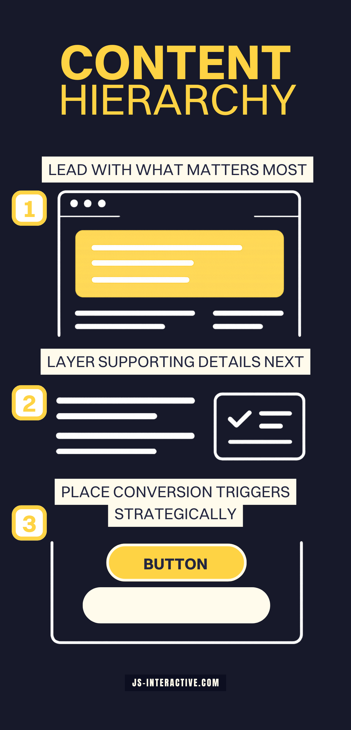
4. Content Hierarchy
The order in which information appears shapes how people interpret its importance.
Content placed at the top of the page gets the most attention, but hierarchy doesn’t stop above the fold. As users scroll, what they see first on each section signals priority.
A strong content hierarchy helps people process information quickly and stay oriented.
In GA4, metrics like scroll depth indicate how far users typically scroll down a page, which helps measure engagement and provide context for how users consume content.
So how do you put content hierarchy into practice? It comes down to three simple priorities:
- Lead with what matters most: Core value propositions and key benefits should appear early.
- Layer supporting details further down: Use the middle of the page for context, proof points, or examples.
- Place conversion triggers strategically: Calls to action, forms, or offers should appear at natural decision points throughout the scroll.
When hierarchy is intentional, users can skim the page without losing the thread. Each scroll reinforces the journey, showing them what matters now and what comes next.
5. Clutter-Free Layouts
A cluttered page makes it harder for visitors to know where to look and what to do.
Too many competing elements, like multiple fonts, overlapping visuals, or a wall of text, excessive use of animations, create confusion instead of clarity.
A clean layout helps direct attention where it matters most. That does not mean stripping the page bare. It means being intentional with what stays and what goes.
Key practices for clutter-free design include:
- Use whitespace strategically: Empty space helps separate sections and gives content room to breathe.
- Limit competing visuals: Every image or graphic should have a clear role in supporting the message.
- Keep choices simple: Too many options at once often leads to inaction.
When layouts are free of clutter, users spend less time figuring out the page and more time engaging with the content and calls to action.
6. Authentic Visuals
Images carry weight. They are often noticed before text, and they strongly influence how trustworthy a site feels.
Stock photos and generic graphics may fill space, but they rarely build confidence.
In some cases, they even send the wrong signal by making a business look impersonal or outdated.
Authentic visuals, on the other hand, connect directly with the audience. This can mean:
- Original photography: Real photos of your team, your office, or your product in use help people see who they are doing business with.
- Contextual imagery: Pictures that support the surrounding content instead of distracting from it. For example, a service page showing the process in action rather than a generic handshake photo.
- Consistent style: Visuals that match your brand identity and tone, from color palette to composition.
As audiences encounter more AI-generated visuals online, they are quicker to notice when something feels inauthentic.
A survey by Stackla found that 88% of consumers say authenticity is a key factor in deciding which brands they support.
When visuals are authentic, they do more than make a site look good. They create trust, strengthen brand identity, and make the overall experience feel credible and human.
7. Calls to Action
Clear calls to action (CTAs) provide visitors with a clear path forward. Without them, even an interested user can stall because the next step isn’t obvious.
Strong CTAs have a few things in common:
- Direct language: Use plain words like “Book a demo,” “Start your free trial,” or “Get in touch.” Avoid vague phrases such as “Learn more” that don’t signal what will happen next.
- Visual contrast: Buttons and links should stand out from the rest of the page without clashing with the design.
- Strategic placement: Place CTAs at natural decision points. A single button at the bottom of a long page is easy to miss, but repeating the same action in a few key spots keeps it visible without overwhelming the reader.
The best CTAs feel like a natural part of the journey. They show up at the right time, in the right place, with the right message. That clarity turns attention into action.
8. Accessibility and Clarity
A website should work for everyone. If people struggle to read text, navigate menus, or interact with features, the experience quickly breaks down.
Accessibility is not just about compliance. It is about respect for the audience and creating a site that anyone can use with ease.
Practical ways to make content accessible and clear include:
- Readable text: Choose fonts and sizes that are easy to scan. Make sure colors provide enough contrast for users with vision impairments.
- Descriptive labels: Add alt text for images, clear labels for form fields, and descriptive link text that clearly indicates to users what to expect.
- Consistent navigation: Keep menus simple, predictable, and structured so users always know where they are and how to move forward.
When accessibility and clarity are prioritized, the site becomes easier to use for everyone, not just those with specific needs. This creates a smoother experience and shows that the business values every visitor.
9. Mobile-First Design
More than half of all web traffic now comes from mobile devices.
If a site does not work well on a phone, it risks losing a significant portion of its audience before they ever see what the business offers. Mobile design can no longer be treated as an afterthought.
A mobile-first approach means building the experience for smaller screens first, then scaling up for desktop. This ensures the essentials work where users are most likely to visit.
Key practices for mobile-first design include:
- Simplified navigation: Menus should be easy to tap and use with one hand.
- Thumb-friendly buttons: CTAs, links, and form fields must be large enough to press without zooming in.
- Responsive layouts: Content should resize and rearrange smoothly across different devices.
- Fast performance: Mobile users often rely on slower connections, so page weight and load times matter even more.
When a site feels seamless on mobile, it creates confidence and convenience. Visitors are more likely to stay, explore, and convert, regardless of their location.
10. Performance
A slow website can deter a user, even from the best design choices. I experienced this firsthand, visiting the Awwwards showcase.
If a page drags, visitors lose patience quickly and often leave before they ever see the content.
When page load time increases from one second to three seconds, the likelihood of a bounce jumps by 32%. That makes performance one of the most crucial aspects of the user experience.
Speed is not just about convenience. It directly affects trust, search visibility, and conversions – your bottom line. A sluggish site signals neglect, while a fast site conveys reliability and professionalism.
Improving performance often comes down to a few focused steps:
- Optimize images: Compress large files and use modern formats like WebP to maintain quality without slowing down load times.
- Limit scripts and plugins: Every extra tool adds weight. Keep only what is essential.
- Use efficient code: Clean, streamlined code reduces the time it takes for pages to render.
- Leverage caching and CDNs: Caching stores resources locally for repeat visitors, and CDNs deliver content from servers closer to the user.
A site that loads quickly feels effortless to use. It keeps people engaged, improves SEO, and creates a stronger path toward conversion.
In many cases, performance is the difference between a site that earns attention and one that fails to do so.
11. Test and Refine
A website is never truly finished.
User behavior changes, technology evolves, and expectations shift. What works today may not work tomorrow, which is why ongoing testing is essential.
Small experiments can reveal big insights.
- A different headline
- A new call-to-action placement
- An updated layout might have a measurable impact on conversions.
Tools like heatmaps and session recordings reveal how people navigate a site, highlighting where they encounter difficulties or drop off.
Analytics confirm what is working and what needs to change.
This process of testing and refinement is at the heart of effective web design for UX. A site that adapts to user feedback not only stays relevant but also continues to create smoother experiences and stronger results over time.
Tested and refined consistently, a site becomes more than a digital brochure. It turns into a living tool that grows with the audience and consistently drives results.
Web Design for The User Experience, Built Better with JS Interactive
Web design for UX is not about chasing trends or adding features for the sake of it.
A good user experience creates websites that feel natural to use, build trust, and encourage people to take meaningful action.
Every element plays a role in shaping that experience.
At JS Interactive, we design with this purpose in mind. Our focus is on turning websites into tools that support business growth while giving users the seamless experiences they expect.
Contact JS Interactive to build a results-driven website for your business.
Share Article