10 Elements of Iconic Logo Design Every Brand Needs to Know
There’s no overstating the importance of logo design.
A logo is one of the first things that comes to mind when you hear a brand’s name.
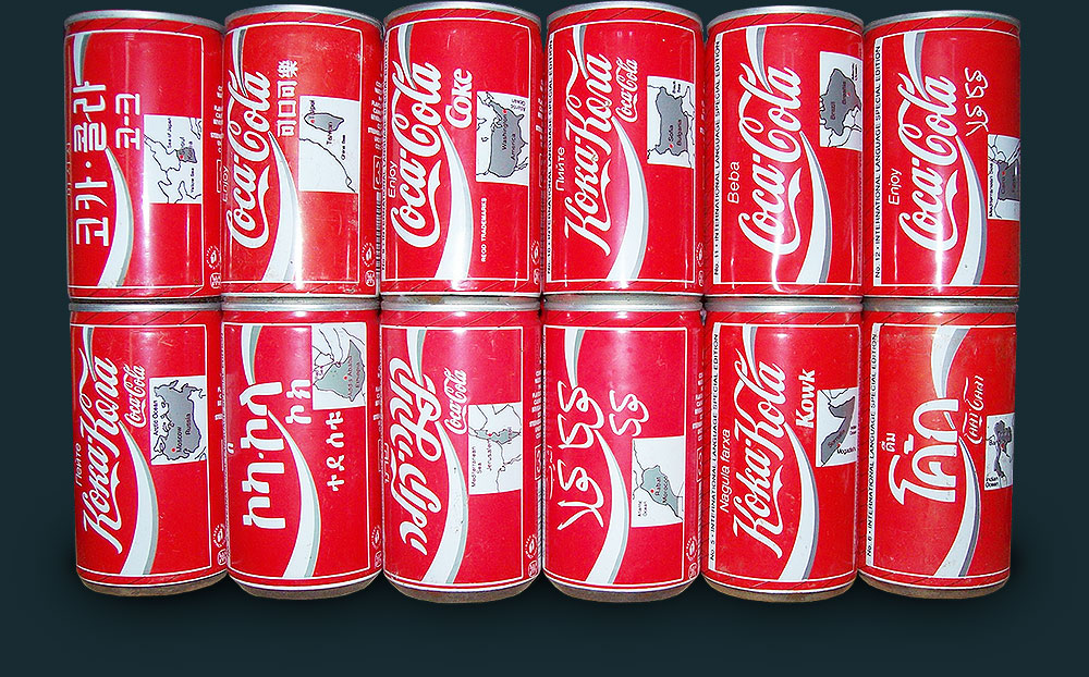
Take Coca-Cola, for example. The global soda company hasn’t updated its signature logo in over 130 years, introducing only limited variations. You can travel anywhere in the world and instantly recognize a classic Coca-Cola—no matter the language.
I thought about this recently while on an exhausting 18-hour drive. Not only did I have plenty of time to think, but I also passed dozens of logos.
When it came time to stop for snacks, drinks, or gas, I never had to analyze the signs wondering what the stores or restaurants were selling.
I could see McDonald’s arches and BP flowers towering in the distance from outdoor signage. I caught glimpses of those blue highway information signs and could instantly tell whether each exit had a Subway, Zaxby’s, Chick-Fil-A, or Starbucks.
Most signs didn’t even need names or taglines.
It was a little harder to differentiate after the 15-hour mark when everything started blending together, but that’s another story.
The point is, a logo design visualizes your brand’s identity. It’s simple, memorable, and iconic.
Ironically, giving your logo either too much or too little thought can both work against you. That’s why I wanted to devote a series of posts to logo design.
This post will cover the basic types of logos and effective elements to consider. In the second part of the series, I’ll dig deeper into the process behind developing a logo.
What is a Logo, Really?
A logo captures the vibe and essence of your brand often without even saying a word. Your logo should connect with the personality of your target audience as well.
Additionally, your logo must differentiate your brand from others in your niche. Using similar colors, styles, or formats to your competition is a major no-no.
Your brand’s logo is something people will instantly recognize and associate with your product or services. On that note, it’s important to design a logo you’re comfortable using for the long haul.
Take time perfecting your logo—and that includes spending time away from the drawing board to avoid overworking the design.
Changing your logo every few months will come across as unstable and inconsistent to your audience. Plus, changing your logo doesn’t give you a repetition advantage. You want people to see the same logo for your brand across as many touchpoints as possible to build familiarity.
That’s why you’ll never see brands completely rework their entire logo design unless they’re going through a full rebranding.
What are the Different Types of Logo Designs?
Before jumping into the essential elements of successful logo design, you should know that there are seven different general types of logos. You’ll choose one as a starting point.
- Abstract: Abstract logos contain freeform shapes or graphics unrelated to the brand’s product. Examples include the Nike swoosh and BP flower.
- Mascot: Mascot logos use animal or human characters, like Quaker Oats or KFC.
- Lettermark: These are shortened, stylized versions of the brand’s name or its initials, like HBO and IBM.
- Pictorial mark: Pictorials are some of the most common logos today, especially among tech companies. Examples include Twitter, Apple, and Target.
- Wordmark: Wordmark logos are like lettermarks, but they include the full brand name in the design. Google and Coca-Cola both use lettermark designs.
- Combination mark: Combination logos include a mix of text-based elements and graphics. These are versatile because you can always split up the design for different applications.
- Emblem: Emblems also include both text and graphic design but in more of a traditional style than combination marks. You’ve seen emblems from Starbucks and Warner Bros.
10 Elements of Iconic Logo Design Austin Owners Should Know
Although logos often seem overly simple, hundreds of hours go into major designs.
Brands like UPS, ABC, and IBM have paid designer Paul Rand anywhere from $30k to $100k for logo designs. You don’t invest that kind of money into something of negligible importance.
Regardless of your products or services, these are the major elements behind every iconic logo design.
1. Simple and Clear
Simple is the name of the game. The best logos don’t include a ton of intricate details, shadows, or even multiple colors. The most iconic logos, the ones you’ll never forget, are the simplest.
Think about all the most recognizable logos today: Twitter, Facebook, Spotify, WhatsApp. They’re all flat single graphics in one color—very sharp and crisp as well.
Bottom line? Don’t overcomplicate things.
2. Memorable
You want a simple logo because you need people to remember it.
Ideally, people should remember your logo after seeing it just one time. Unless you’re a household name, that won’t happen. That’s all the more reason to keep your logo simple.
A memorable logo gives people time to familiarize themselves with your brand. They’ll see the logo and instantly recognize you.
3. Timeless
Look at Pepsi’s logo throughout the years. Every decade, Pepsi jumps onto the latest style trend to modernize their logo.
Pepsi has the global reach to experiment with logo design without damaging its trust. Most of us don’t have that luxury.
Your logo must be timeless so any necessary updates you make over the years can be extremely minor so you won’t lose recognition.
4. Versatile
Versatility is especially important today with so many digital logo applications:
- Social media profile photos
- Social media headers
- Holiday and seasonal graphics
- Email header images
- App icons
- Partnership badges
- Bio icons
- Image watermarks
- Podcast graphics
- YouTube thumbnails
As you design your logo, think about all the ways you might use it in your digital marketing applications. Your logo should be versatile enough to fit in every single one.
You might not have plans for an app or podcast today, for example, but that could change in the future. You definitely don’t want to redesign a logo because your existing one couldn’t be cropped or adjusted without losing quality.
5. Appropriate
A point often overlooked in today’s disruptive startup culture, your logo should be appropriate for your product/services and audience.
Using pastel colors and cursive fonts for a B2B fintech payment system wouldn’t be appropriate. In fact, it would downright confuse people.
6. Balanced
All the elements within your logo design—like the graphic, name, letters, and tagline—should hold a balance. You don’t want anything too top-heavy or misaligned.
You want a logo that’s easy on the eyes with both the placement and size of all elements in perfect flow.
7. Use Whitespace
Overworking your logo will no doubt lead to a design cluttered with details, graphics, and text all crammed together. Not good.
The best logos include plenty of space between every element and the outline.
8. Consider Contrast
Color choice is especially important in logo design for a few reasons.
First, you must consider that roughly 8% of all men and 0.5% of women suffer from varying degrees of colorblindness. An orange-green logo might look bright and brilliant, but millions of people won’t be able to tell.
Contrast also matters when you consider that plenty of devices offer dark mode browsing. Platforms like Google and Facebook could end up flipping your logo colors automatically for dark mode users. High-contrast logos work best in this situation.
Plus, high-contrast colors grab attention and they’re easy to recognize. Just think about Spotify’s iconic black and green.
9. Understand Typography
If you decide to include your full brand name and a tagline in your logo design, consideration for typography hierarchy is essential.
Nothing looks more off and unsettling than unbalanced typography hierarchies. Your logo will rub people the wrong way, but they won’t be able to put their finger on why.
Always consider the shape, weight, and size of your fonts. Definitely don’t use more than two fonts. Remember, it’s all about balance.
10. Uppercase Vs. Lowercase
Speaking of typography, you’ll also need to decide between upper and lowercase, if you include text. Fully lowercase was in style recently, but uppercase gives a bold look as well.
Consider your font choice and size as well. Avoid uppercase writing for cursive or complex fonts, but consider using uppercase to help small, thin fonts stand out.
Partner with a Logo Design Team in Austin Who Understands Your Brand
We don’t understand your brand right now. We will, however, spend time getting to know who you are behind the logo, your audience, goals, and mission, and anything else that’s important to you.
Our expert designers, writers, and SEO consultants treat your brand like our own. That’s how we’ve managed to win so many designs and marketing awards over our 15+ years in business. It’s how we help countless clients surpass their digital marketing goals.
Browse the JS-Interactive portfolio to see some of our design work and how we’ve helped clients reach new marketing heights.
Get Marketing Insights to your Inbox
Boost visibility, outshine your competitors and attract more customers